
Like Night and Day
A couple of weeks ago, while many of us here in Oregon were busy figuring out where we were going to position ourselves for the historic total solar eclipse, Sage Intacct dropped its third 2017 release, on August 18.
There are a number of functional improvements that I’ll talk about in coming weeks, but the first thing is another iteration of the Intacct Action user interface, which is night and day from the current UI, although possibly not quite as startling as a total eclipse.
Intacct Action is going to be the default UI within the next couple of releases, but we recommend our users turn it on now and get familiar with it because you might find it helps you do your job more easily – and this is a great time to find out what you like and don’t like, and you can make comments directly back to the product developers. They really are paying attention to what customers are saying!
Aside from that opportunity, the more we each work with the new interface while it’s optional, the less stress we’ll have when we need to make the switch once and for all. Of course there’s a lot to love about the new UI, but it works differently so there will inevitably be some adjustment period. Think of this time like visiting an exciting new city before you pull up roots and move there.
To get going with Action UI, click on the Enable Beta UI link above your log-in name on the right header on any Intacct page.
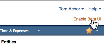
Your view of Intacct will immediately change to the new UI. Turning Action UI on is not a one-time decision. You can switch back and forth between Action and the standard UI as often as you like. The On/Off switch is also where you can give feedback on your user experience.

So let’s take a look at some of the changes:
Aside from the different fonts and spacing, the first thing I noticed was that although my applications were still listed across the top bar, they no longer drop down to menus when I hover over them. Instead, I now click on the name of the module. Then the screen displays the Overview page for that application. That graphic Overview page has always been available, but it’s been embellished and moved to front and center. So you can go directly to transactions in the flow by clicking in the Overview or go to the menus.

The menus now cascade down the left-hand sidebar. There are two ways to view that menu: Favorites or All. It’s super easy to go down the All menu and add items to Favorites: just click on the star next to the menu item to turn it to gold, and presto, it’s now a Favorite.

Another thing you might notice right away about the menus is that some things that used to be in Lists at the top left of the menus (Customers, for example) are now in Setup. The Setup menu is no longer hidden in a shadow column, as it has been, but is in line with the other menus, at the bottom.
You’ll also see that some menu items aren’t displayed by default but are “rolled up” until you need to see them. Those are indicated by a little right arrow, which you can click on to reveal the hidden details.


If you have a lot of modules, you may want your top bar to be in a different order so that your most-used apps are handier. While this has always been an option in the existing interface, under the Action UI, it’s ridiculously easy. Just grab the name of the module. It turns green and you drag it to the position you’d like. That’s it.


This is a good start on the basic navigation of Intacct Action, but there’s much more. In coming weeks, we’ll take a look at the new features that exist only in Action, like the AP Workbench, which will let you apply credits easily and pay bills immediately or optionally filter bills and save them in an outbox for later payment.
Take Action now so you're ready when the new UI eclipses the old one once and for all!